Painting a Nude in Oil: From Drawing to Finished Canvas
Approach
My nude paintings are made from drawings I do from a live model.
I therefore start from a drawing with a few shadows and all colors are invented. This way of working, which began as a constraint (the impossibility of having a model pose for days on end), quickly turned out to be a space of freedom and experimentation in color, lighting moods and composition.
Freed from the temptation of likeness, it is easier to play with colors, improvise and fumble along without worrying about building a believable setting.
I like improvising a composition around a nude painted under a chosen lighting. Anything goes as long as the background brings aesthetics without smothering the subject, serves the intent and stays secondary.
In this approach, drawing matters fundamentally. It must be solid, balanced between shadows and lights, and precise enough to serve as the model for the painting.
Besides, decisions are much easier to make in drawing than in paint, so I sometimes redo a life drawing to settle an uncertainty about lighting, strengthen an expression or fix some anatomical mistake.
I also paint regularly from life — portraits or smaller-format nudes. That feeds my sense of how skin renders.
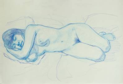
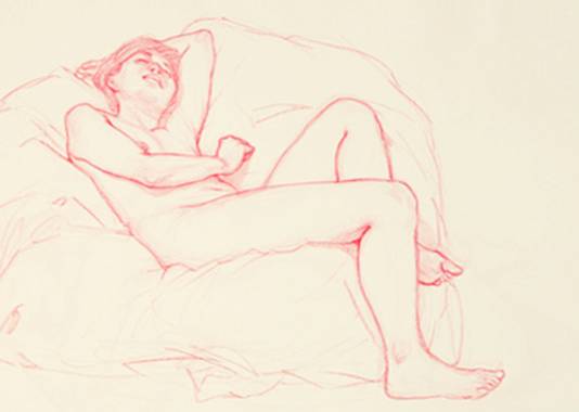
drawing made from a live model
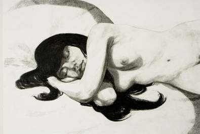
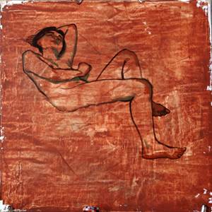
study traced from the first drawing
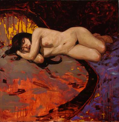
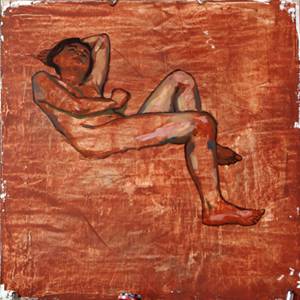
painting made after the study
Materials
Support
6mm wood fiber panel, coated with gesso and tinted.
Brushes
- round hog bristle brushes for flesh. Three brushes, one per use (so they don't need cleaning too often): lights, midtones and darks. Often two brushes for lights: one for yellows, another for pinks.
- wide synthetic spalters for the dark strokes of the background
- flat hog bristle brushes, long ones for soft-edged washes, short ones for hard-edged bands
- a rectangular palette knife finger-length to apply lots of material, and a triangular rounded-tip knife smaller than a thumb to lay pure color on small areas.
Medium
- essentially turpentine for drawing the body
- mineral spirits for the first dark layers of the background
- a mix of linseed oil and turpentine to paint the flesh
- on the palette, occasional additions of stand oil to thicken the material and improve grip
Color palette
for the flesh:
- titanium - zinc blend white
- deep Japanese yellow
- flesh ochre or transparent red oxide
- carmine red and emerald green (imitations): makes a lovely adjustable violet for graying the flesh
- burnt Sienna
- natural umber
- Van Dyck brown
other colors for the background:
- red ochre
- Prussian blue
- Payne's gray
- yellow ochre
The life drawing
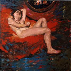
The following painting, medium format (70 x 70cm), was made from the drawing beside it.
A life drawing usually takes one 30 to 50 minute session with a break in the middle. Sometimes it is done in one go when the pose is very comfortable, as is the case here.
I work on raisin or A2 format. I use a colored pencil whose contact on paper is less harsh and slippery than graphite, slightly waxy without being sticky, and soft enough to mark without pressure. This allows gentle gestures, curves and serpentine lines that define volume modulations better than parallel hatching. The sinuous line is also more sensual, which suits the subject.
I sometimes complete the first light-color line with another, darker one to stress the darkest parts and contours (as in the previous drawing, sky blue and ultramarine).
This drawing being fairly precise and its shadows well defined, it will serve as the basis for an oil painting.
Step 1: preparing the support
The wood panel gets two coats of gesso troweled on with a large spatula, then sanding. Then I spread red ochre diluted with spirits with the spatula, letting the irregularities of the support show through for a raw, marbled effect.
The average value of this background — lighter than lit flesh, darker than shadows — will serve as a value landmark, above all avoiding painting too light (any color looks dark against a white ground).
The drawing is copied with very diluted Van Dyck brown for a fluid line, shadows in natural umber.
Step 2: first touches
I lay the first touches of color, some flushes at the joints, trying one color or another, fumbling a little, knowing this is only an underpainting to be thickened, lightened or darkened, blended.
To avoid polluting future colors in case of bad choices, I use transparent, low-opacity colors: transparent iron oxide, burnt Sienna, Japanese yellow, carmine, emerald green — and definitely no titanium white, far too covering and chalky; rather a titanium / zinc white.
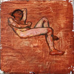
Step 3: thick layer with the knife
Building on those first touches, I generously spread thick layers of various flesh colors with the knife, letting pure, poorly mixed color show through in places — which can later give an interesting reflective effect.
I am not concerned yet with blending and modeling at this stage, but with having an overall vision. I step back and blur my gaze: from afar it should look like flesh colors under warm lighting. I am not afraid of losing my drawing under the material since my reference drawing sits on paper nearby.
Step 4: lights, shadows and composition
I complete the lights, color the shadows with natural umber or burnt Sienna, begin blending transitions with the brush, then rough out a composition by drawing the lines of force of the background.
The point is to balance the whole, break the monotony of the large empty surface at the bottom of the canvas and introduce curves or diagonals to temper the angular silhouette of the body.
It is also about raising contrast: placing some darks early over a medium-light ground before reworking the values and colors of the skin.
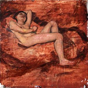
Step 5: the background, a contrast of hues
With the background's compositional lines in place, I spread knife-applied dark-valued colors forming a contrast of hue between top and bottom, avoiding the monotony of a composition where a bright, nearly central subject would stand out too starkly from a uniformly dark background.
Flesh highlights being warm, I look for background colors among warm tones (red ochre, brown) or among the colder shadows of skin (natural umber) so the warm lighting stays coherent.
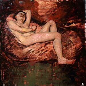
Step 6: reflection and contrast
After some fumbling with the background, I paint a mirror at the top to balance things with a contrasting element, then come back to the flesh and raise contrast: reinforce shadows, fuse lights and strongly lighten the belly under the arm's shadow to make it the brightest, most contrasted zone of the painting. Then I boost a few local highlights and refine the drawing.
As time passes, the material becomes more viscous and adhesive, making it easy to add more. The soft, moderately covering titanium-zinc white allows gaining brightness very gradually.
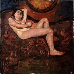
Step 7: a living background
Flesh finally painted, I spread a wide red ochre surface and lighten it in the wet with light yellow (yellow ochre, white), essentially around the luminous center of the canvas.
Then I bring the background to life by laying pink lights (carmine + white) over the red ochre and burnt Sienna of the backdrop, and blueish darks (Payne's gray, Prussian blue). These strokes follow the curve of the mirror to add rhythm and movement.
The reflection in the mirror is obtained with the knife, using the blueish darks and orange-yellow lights already in use.
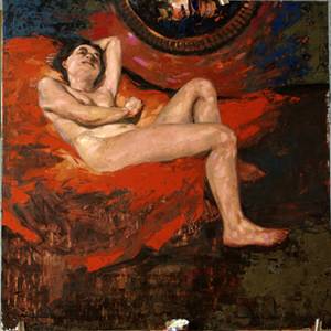
Step 8: final touches
The whole being dominated by reddish browns and the bottom of the canvas monotonous, I lighten it with a blue gray (Payne's gray, Prussian blue, white) applied by knife, biting in bands over the red surface; I also put red over the lower blue. Horizontal strokes may suggest a water surface.
Finally, I lay a light blue reflection (Prussian blue, white) over the dark blue at the bottom, and some greened yellow ochre in the top right corner to liven these zones up. The composition being more balanced and the raw look to my taste, I decide to stop there.